
Mixing yellow and green in paint produces a yellow-green, often referred to as chartreuse green or lime green. The result seems straightforward on paper, but the exact shade depends on rarely mentioned variables: the type of pigment used, the ratio between the two colors, and even the application surface. Understanding these parameters allows for anticipating the outcome rather than fumbling blindly.
Phthalo pigment or chrome oxide: the starting green changes everything
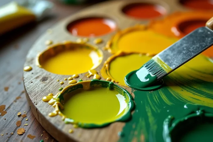
Not all greens in tubes behave the same way when faced with yellow. The chemical composition of the pigment determines the saturation, brightness, and warmth of the final mix.
See also : What to Do When the Car Key Warning Light Appears on Opel Meriva: Causes and Solutions
A phthalo green (often labeled “phthalo green” by manufacturers like Gamblin or Golden) is a highly saturated and transparent pigment. When mixed with cadmium yellow, it produces bright yellow-greens, close to lime green, with high brightness. This is the logical choice for achieving spring foliage or tangy accents.
A chrome oxide green, on the other hand, is opaque and more muted. Adding yellow does not transform it into a bright chartreuse: instead, it results in a warm olive green, earthy, which leans towards khaki as soon as the proportion of green exceeds that of yellow. A guide detailing the color yellow and green in mixing confirms that these pigment variations explain the discrepancies in results between two painters using “green and yellow” without further specification.
Further reading : What Your Nails Say About You: Current Trends and Techniques
Comparison table of results based on the green pigment used
The table below summarizes the trends observed in the color charts of artist paint manufacturers. The results vary slightly depending on the brand and medium (oil, acrylic, gouache), but the main lines remain stable.
| Base green pigment | Added yellow (common type) | Shade obtained | Saturation | Opacity of the mix |
|---|---|---|---|---|
| Phthalo green (PG36/PG7) | Cadmium yellow (PY37) | Lime green / bright chartreuse | High | Semi-transparent |
| Phthalo green | Citron yellow (PY3/PY175) | Cold, acidic yellow-green | High | Transparent |
| Chrome oxide (PG17) | Cadmium yellow | Warm olive green | Medium to low | Opaque |
| Chrome oxide | Citron yellow | Cold olive green, slightly grayish | Low | Opaque |
The “saturation” column is the most discriminating. A phthalo green + cadmium yellow gives the brightest mix, while chrome oxide systematically leads to muted tones.
Yellow-green ratio and position on the color wheel
Yellow and green are neighbors on the color wheel. Yellow is a primary color, while green is a secondary color (a mix of yellow and blue in subtractive synthesis). Their proximity explains why the mix never produces an unexpected hue: it stays within the same family, between pure yellow and pure green.
What varies is the slider. Here’s what adjusting the ratio gives:
- Majority yellow (about 70/30): you get a warm yellow-green, close to chartreuse yellow, which retains the brightness of yellow while slightly shifting towards green.
- Equal parts (50/50): the typical result is a clear chartreuse green, neither warm nor cold, often the most representative of what is called “lime green” in commercial color charts.
- Majority green (about 30/70): yellow warms the green without dominating it, producing a prairie green or apple green depending on the starting pigment.
Adding white to the mix lightens the shade towards a pastel green. Adding a touch of black or umber darkens it towards olive or khaki, shades widely used in interior decoration and landscape painting.
Why the surface matters too
On a canvas prepared with white gesso, the mix appears brighter than on brown kraft paper. The background absorbs or reflects some of the light, which alters the perception of the hue. In watercolor painting, the transparency of the medium further accentuates this effect: the color of the paper contributes to the final rendering.

Screen versus palette: the yellow-green cannot be reproduced identically
In digital design, a lime green displayed in RGB (additive light synthesis) is often more saturated than what a painter can reproduce with pigments. The CMYK guides from Pantone and Adobe indicate that the RGB and pigment gamuts do not overlap on bright yellow-greens. A bright chartreuse on screen may appear dull once printed or painted.
This constraint has led several artist paint manufacturers to offer dedicated yellow-green pigments (such as PY129 or certain proprietary blends) rather than leaving the artist to mix yellow and green alone. These pre-formulated pigments achieve a saturation that simple mixing on a palette does not always allow.
Decorative painting and facades: a mix with thermal properties
In building paint, the yellow-green mix finds an unexpected application. Recent recommendations on solar reflectance for facades have led manufacturers like Tollens and Sto to favor yellow-green shades rather than pure dark greens for exterior walls. These yellow-greens reflect more sunlight, limiting overheating of the facades while maintaining an appearance perceived as green.
A dark green absorbs a significant portion of infrared radiation. A light yellow-green, achieved by adding yellow to the formulation, improves the thermal comfort of the building without resorting to white or beige. The palette of acceptable greens for facades has thus expanded towards chartreuse and lime green tones.
The yellow-green mix in painting is not trivial: the chemistry of the pigment, the ratio of colors, the surface, and even the context of use (artistic, decorative, digital) produce distinct results. Choosing the starting green precisely remains the most determining variable for mastering the final hue.